Eyetracking hardware is expensive. Very expensive. Yet, eye-tracking can be one of the most illuminating usability experiments for you website.
After all, if you know what’s catching your visitors’ attention, you can make better decisions about what elements to place where.
Assuming that you’re not at the stage to implement a full eye-tracking study in-house, what can you learn from studies on other sites? Here are five eye-tracking tests (and links to lots more info). Use them to help you judge where and what to put on your site.
The F-Shape
Probably the most famous concept in eye-tracking and web usability is Jakob Nielsen’s “F-Shape”. His early eye-tracking study showed that online readers view websites in an “f pattern” as shown below.
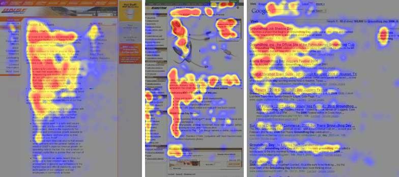
For your website, that means getting your most important content to the top and left of any web page. Full story and analysis at the Alertbox site.
Google Results
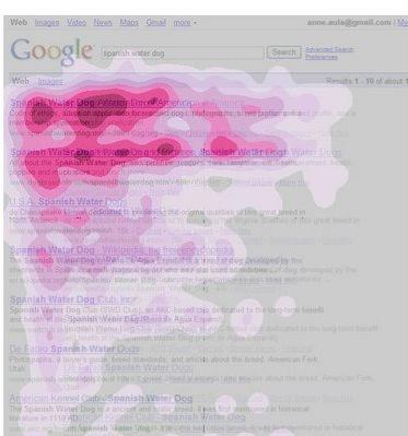
A 2009 post on the Google Blog outlines a few of the results from their own eye-tracking studies. One revealing image demonstrates how people view a Google search results page. It shows that if you’re not near the top of the search results, you’re not likely to get seen, let alone clicked on:
Poynter Institute
The Poynter Institute looks at web usability from the news and media content angle.
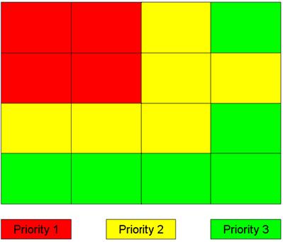
This enormous post contains lots of interesting info (including their claim that smaller fonts stop readers from scanning your copy and encourage full reading). They also include a simplified “priority map” to help you judge where to put ads and crucial calls to action:
Gazehawk
Did we say that eye-tracking studies always have to expensive? We take it back. A new company called Gazehawk have developed a system that uses standard webcams for basic user testing.
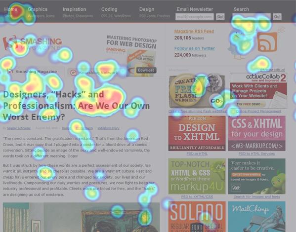
Another company, Webdistortion, ran their own tests on some of the world’s biggest blogs using Gazehawk. Though the results are only based on very small samples, they’re still revealing, such as this map of Smashing Magazine (note the elements and colours that stand out for the reader):
Why does usability matter?
In the end, eye-tracking is just one more tool in a professional website designer’s arsenal. It helps you guide people through your site by understanding where their focus lies. It encourages smooth interactions and increases user engagement. Get in touch if you want to talk about improving your site.
